

Home Assistant Mobile Dashboard With Big Buttons
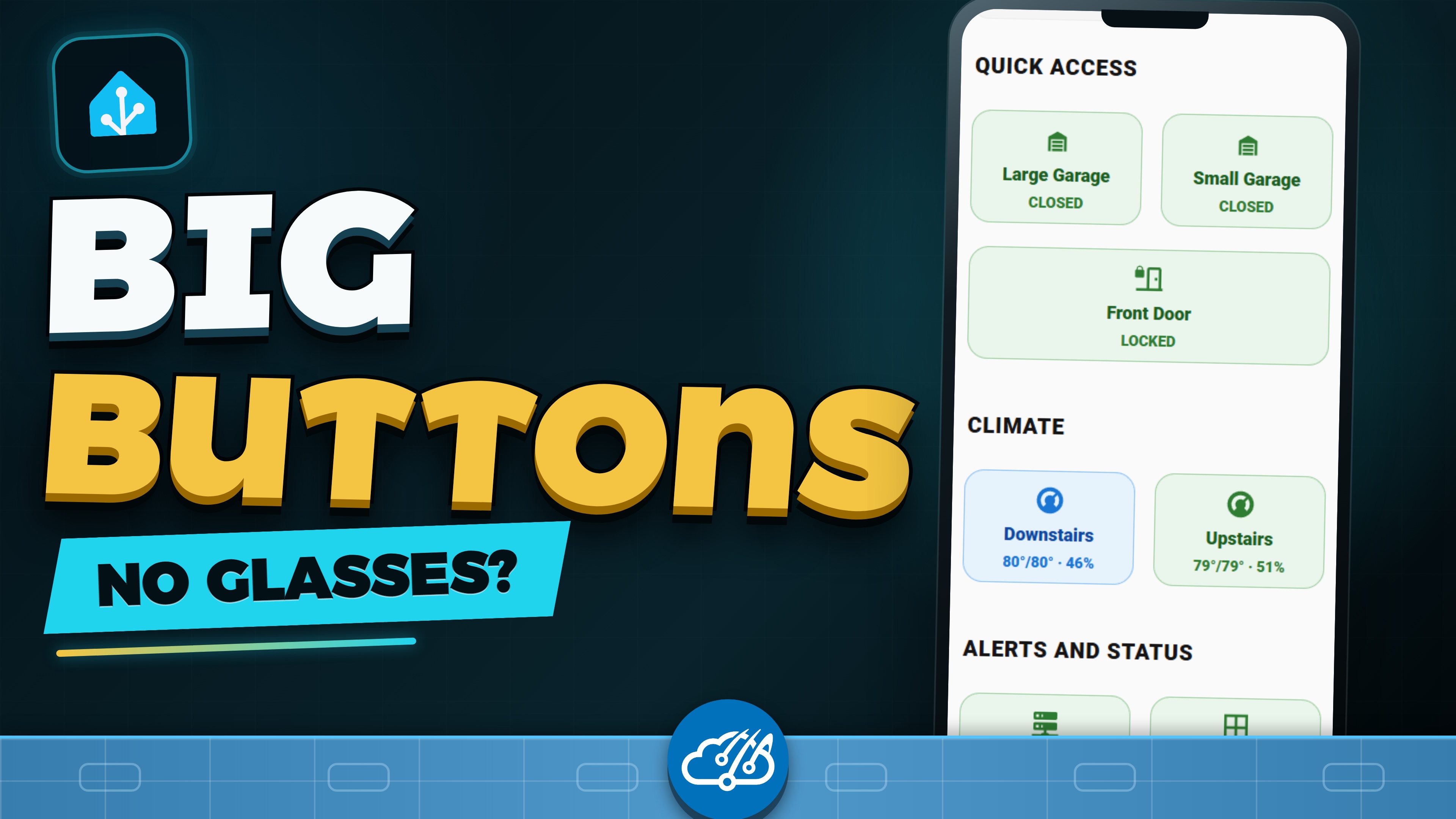
A dedicated Home Assistant Mobile view puts garages, locks, thermostats, status, and camera drill-throughs behind large two-column controls that work even when I do not have my glasses.
My Home Assistant desktop dashboard has earned its density. When I am sitting at my desk with a large screen, I want the whole control center: active problems, infrastructure health, power, climate, and detailed status. My phone has a much shorter job list.
Most phone visits happen when I need to close a garage door, unlock the front door, check a thermostat, or see why a package alert fired. I am often standing in a hallway without my glasses. A miniature copy of the desktop dashboard makes every one of those jobs harder than it should be.
Give each screen a clear job
The design rule that finally made this click was simple: desktop is the control center, mobile is quick access. I kept the existing Overview dashboard and added Mobile as its second view, immediately after Home and before Cameras. It is always one obvious tap away, with no separate dashboard URL to remember.
The Mobile view uses two vertical columns of large controls. That layout fits a phone naturally, leaves room for readable labels and state text, and gives every target enough space for an imprecise thumb. Both garage doors, the front-door lock, and the thermostats sit at the top because those are the controls I reach for most often.
Design around the first tap
A quick dashboard should answer a practical question on the first screen. Is the garage open? Is the front door locked? What temperature is the house? Each tile shows the current state and opens the native Home Assistant control when I need to make a change.
- Large buttons and high-contrast labels that remain readable without glasses
- Two predictable columns that are easy to scan with one hand
- Direct controls for doors, garages, and climate
- Compact status for systems, entry points, and packages
I left people, maps, history, and most camera feeds off this page. They are useful elsewhere, but they compete with the fast controls that justify opening Home Assistant on a phone.
Make drill-throughs earn their space
The lower status tiles still lead somewhere useful. Packages opens the front doorbell camera, which is usually what I want after a delivery notification. Systems opens the full operations dashboard for infrastructure, network, power, and service details.
Those destination pages now have a large Back to Home control at the top. I do not have to hunt through navigation after checking a camera or troubleshooting a system. The quick page becomes a reliable starting point instead of a dead end.
Start with a dedicated Lovelace view
This approach does not require a second Home Assistant installation or a completely separate dashboard. The Mobile page is a dedicated YAML Lovelace view inside the main Overview dashboard. That keeps the familiar navigation, themes, resources, and shared button patterns while letting the phone layout stay focused.
You can browse my Home Assistant dashboard source and patterns on GitHub. The entity IDs are specific to Bear Stone, but the structure is portable: choose the handful of actions you perform while moving, give them generous touch targets, and send secondary tiles to purposeful detail pages.
This is also the mobile use case I pictured when Lovelace became the standard Home Assistant interface in 2019. The newer Fire tablet camera kiosk solves a different fixed-screen job. Together they reinforce the same idea: design each Home Assistant screen for where it lives and how you actually touch it.
Watch the mobile dashboard walkthrough
The short walkthrough shows the two-column page, the door and climate controls, the Packages and Systems drill-throughs, and the larger desktop control center that sits behind it.